6 Ways To Be Bold With Colour
Gone are the days of beige-on-beige, creative and daring colour choices are a fantastic way to express yourself, and to add a beautiful new dimension to your home. There‘s no easier, quicker way to completely reinvent or revive your space than through incredible colour, so our design team here at Stitched have made it super easy to take the plunge and go for colour-on-colour this year… you’ve got this!

01. Look inwards
Step one: think about the colours that you really, really like. What colour or colours resonates most with you? Look at the art you like, the clothes you like to wear, the images you save on social media. Be led by your own individual likes and dislikes, and remember, the most creative schemes usually come from playful self-expression! Artist Wassily Kandisky said “colour is a power which directly influences the soul’, so get thinking how it influences yours.

02. Take a baby step (if you want)
Get creative with patterned or coloured cushions to explore what you like, or use smaller decorative items, like bowls, candles, and vases, and get inventive. You could even try neutral tones layered with pops of colour. This can be a beautifully effective way at really highlighting your bolder pieces in all their glorious splendour.

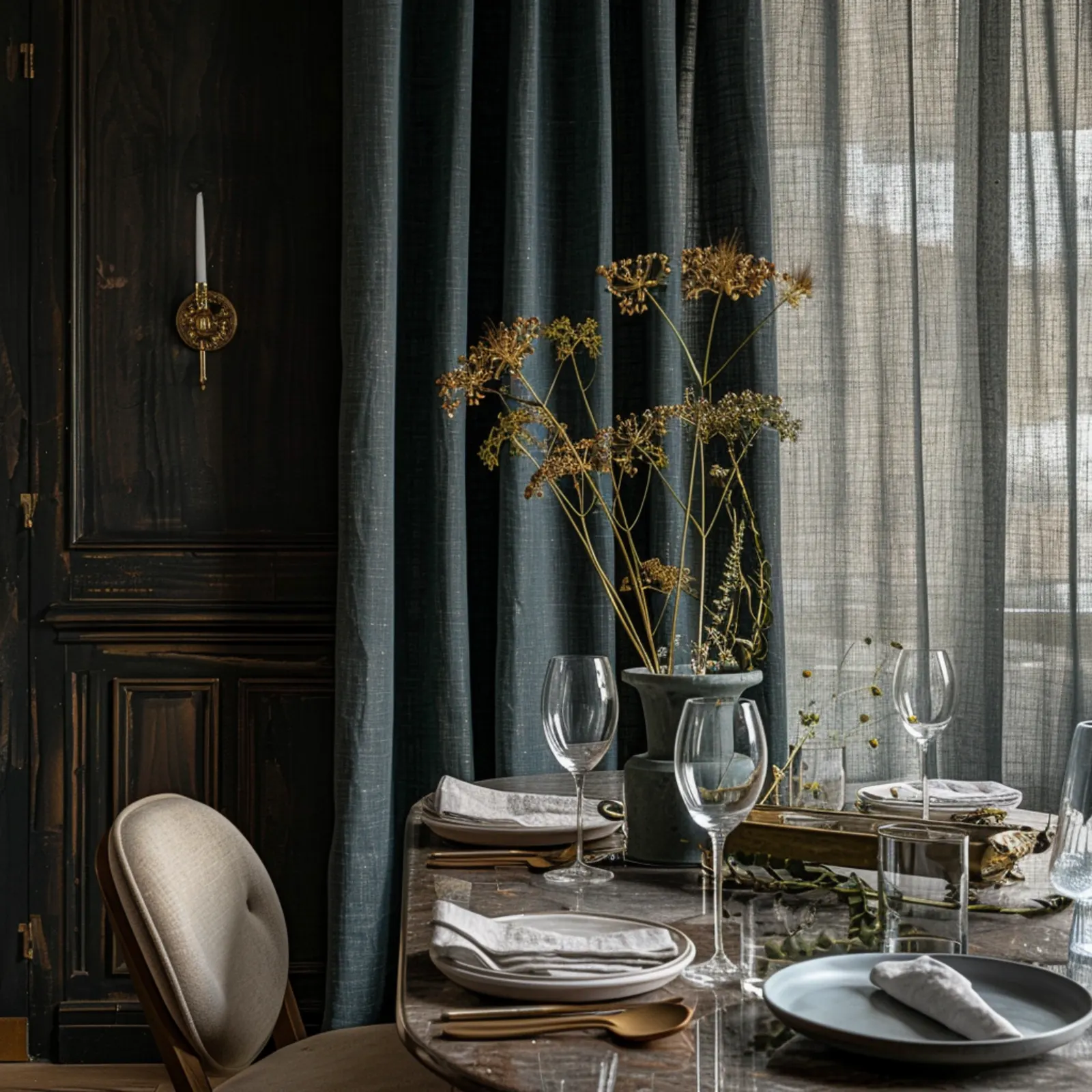
03. Consider the nature of the fabric itself
Multidimensional plains with rich textures, like flax or hemp, are a great way to add personality to any space and work well with all shades of colour, from bright to faded. These textures can create real impact and drama. However, if you are looking for something truly bold and striking, our Wool range is the fabric for you. Not only is this fabric super-soft, being crafted from sustainable wool, it also retains bold, bright and flatter colour than other fabrics, making this fabric even punchier in appearance. We’re big fans, even if we are a little biased… If you lean towards a softer colour palette, gentle silks and voiles are naturally your friend. Our Upcycled Silk range for instance has a three-tone tweed effect, that reflects light and instantly creates a softer, diffused effect - it’s a win-win.

04. Mix it up
Some designers advocate using colours from only either the “warm” or “cool” palette of the colour wheel to ensure that the end result is harmonious. However, a colour can be defined in many ways - pink can be both a cool-toned and warm-toned colour, for example. Instead, choose to embrace contrast in all its forms. Look at the recent pink and green trend for instance. Soft fleshy pink and vibrant leafy greens provided a fresh and gorgeous combination that someone took a chance on, and it worked.

05. Think 60-30-10
For foolproof colour boldness, aim to apply the 60-30-10 rule to create a balanced, beautiful space. 60% acts as the base colour, and by ‘colour’ we mean colour family, like greys, blues, pinks, or different variations of whites and creams. Use your 60% base across the main surface areas like walls, and larger pieces like big rugs, sofas or dining tables.
Next, use 30% of another colour family for textiles and soft furnishings, like smaller pieces of upholstery, furniture, bed linens and curtains. The final 10% is reserved for accent pieces, like decorative objects, art, and cushions. Using three main colours in this way will achieve a stylish, harmonious look that you can fall in love with.
06. Define your own, individual ‘bold’
Soft and subdued, moody and delicate shades, or vibrant, bright, and in-your-face: The truth is, “bold” colour palettes can be any types of colours used in interesting ways. Anything goes, the whole point is expressing yourself - dare to be different and really embrace your own style.