Colour Stories: Red
In the words of Diana Vreeland, the legendary editor-in-chief of Vogue, “Red is the great clarifier: bright, cleansing and revealing. I can’t imagine becoming bored with red - it would be like becoming bored with the person you love.” Arguably the most dramatic colour in the spectrum, red always triggers an emotional response. Read on to discover the history and psychology of this manipulative hue as well as ideas for using it successfully in your home.
Using Red in Your Home
So, how best to use a colour that’s no shrinking violet in your home? Firstly, it’s important to play to red’s strengths and use it in rooms that will benefit from its fiery, exuberant qualities. So how about a red bedroom where an injection of passion has got to be a good thing. Or choose red for a dining space to stimulate palettes and encourage animated conversation. Be careful not to pair with yellow though, unless you’re aiming for a McDonald’s-like ambience! Red is best avoided in rooms that are likely to suffer from an inherent excess of heat and also use with caution in rooms such as studies and meditation spaces where concentration is important.
As with all primary colours, red is easier to use when it’s slightly ‘knocked back’ through the addition of other pigments rather than in its strident, pure state. Depending on the pigments used, red will become warmer - as it veers towards orange and yellow - or cooler as it moves towards blue.
Our Port and Watermelon Wool fabrics are gorgeous, warm reds, full of youthful energy and optimism. Team with amber, chocolate and warm metal finishes to create a rich, welcoming space in a living room.
In contrast, our Chilli Linton and Merlot Silk are cooler, sophisticated reds, perfect in bedrooms paired with deep berry shades, silver and pops of acid green for extra zing.
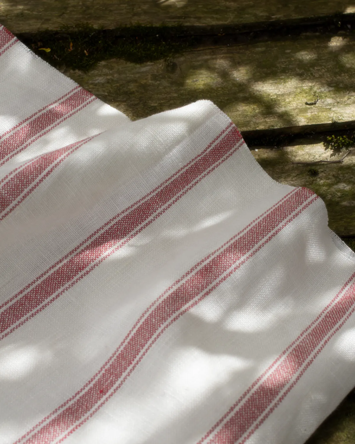
Or for a more paired back red, our Tuscan Gingham in Rosewood is a classic kitsch fabric that would add a playful element to a kitchen or dining room. Reminding us of fairytale picnics, this could also be a lovely choice for adding colour to a children’s bedroom.
Whatever red you choose, you’re sure to make a statement, so be bold and go for it.
Get Inspired: Red Curtains and Blinds

Red living room curtains
Create a playful interior by pairing red curtains with other bold colours in your living room.

Red bedroom curtains
Brighten up a dark wall colour with a statement curtain. Ideal for creating warmth in a bedroom.
Stripy red curtains
If you want to introduce red but in a more subtle way, our Ian Mankin Angus Stripe is the perfect solution.

Add colour to white walls
If you can’t deviate from white walls, add colour through your window apparel!
The Colour Red: A Long History
This effect on the human psyche goes back a very long way. The Ancient Egyptians wrapped their mummies in linens dyed in hematite, a red-coloured mineral. This ensured they were warmly welcomed in the afterlife by the god Osiris, known as ‘lord of the red cloth’. The Romans prized red for its associations with power and influence, and the Chinese - from ancient to modern times - have seen it as the colour of joy, good luck and fortune. Gifts of money are still given in red envelopes at Chinese weddings and other special occasions.


The Colour Red: Science and Psychology
The fact that red has the longest wavelength in the visible light spectrum leads some to think, incorrectly, that it’s the colour most clear to the human eye. In fact, that honour goes to bright green but red has the quality of appearing nearer than it is and grabbing our attention - - - so the perfect colour for traffic lights, stop signs, postboxes and anything else that needs to be noticed.
Red is the colour of warmth, energy and excitement. Companies such as Coca-Cola and Virgin Group who want to convey a sense of fun, rebellion and excitement have long realised the power of red in their branding. Adversely, it’s also the colour of anger, heat and attack. We go red when we’re upset and our hearts quicken at the sight of it. Before the move to improve their healthy eating credentials, a number of fast food chains used red in their restaurants to make people feel hungry but would pair it with strongly contrasting colours to ensure they didn’t linger. The psychological effect was that time was moving faster than it actually was, so customers would hurry up, eat their food and depart.
Our Top Red Fabric Picks
Make a start on your new red curtains and blinds by ordering some free samples.
ORDER RED SAMPLES


