Book our home measuring service in London

Colour Stories: White
Ivory, chalk, snow, linen or milk. In the world of decorating, the colour ‘white’ has many aliases and in most instances, is not white at all. Instead, these myriad hues are off-whites, produced when other pigments are added to titanium white and it can be a daunting prospect to choose between them. Read on to discover the history of white and what to consider when selecting the right white for your home.
Using White in Your Home
The direction a room faces and the amount of natural light it receives have the greatest impact on which colours to choose and how they are perceived. And this is particularly true of white. In the Northern Hemisphere, north-facing rooms receive an even, indirect light that can appear cool and harsh. Best then to avoid cool blue, green or grey tinged whites which are likely to appear drab. Instead, choose warm whites with a yellow or red base that will do a better job of bouncing whatever light is available around the room.
South-facing rooms are a decorator’s dream and essentially you can’t go wrong with any off-white. So your choice then is influenced by other colours you plan to use, the architecture of the space and the ambience you want to create. As a general rule, cooler whites tend to look more contemporary and work beautifully with cooler blues, greens and greys. Warmer whites are more classic and the perfect compliment to reds, oranges and warmer hues.
East-facing rooms get the morning light which is usually bright and cool so choose cooler off-whites to work in harmony with this. In contrast, west-facing rooms are more muted in the morning and warmer in the evening. Warmer off-whites will therefore be the most effective choice. If you have a dual-aspect room, it’s important to recognise that the light will change dramatically throughout the day. Think about when you spend most time in these rooms and choose your off-white accordingly.
Finally, remember that artificial light will also have a dramatic impact on the colours in a space so always look at fabric and paint samples in situ and at different times of day before making a final decision.
Get Inspired: White Curtains and Blinds

White nursery roman blind
Create a neutral theme in a nursery with white blackout-lined roman blinds.

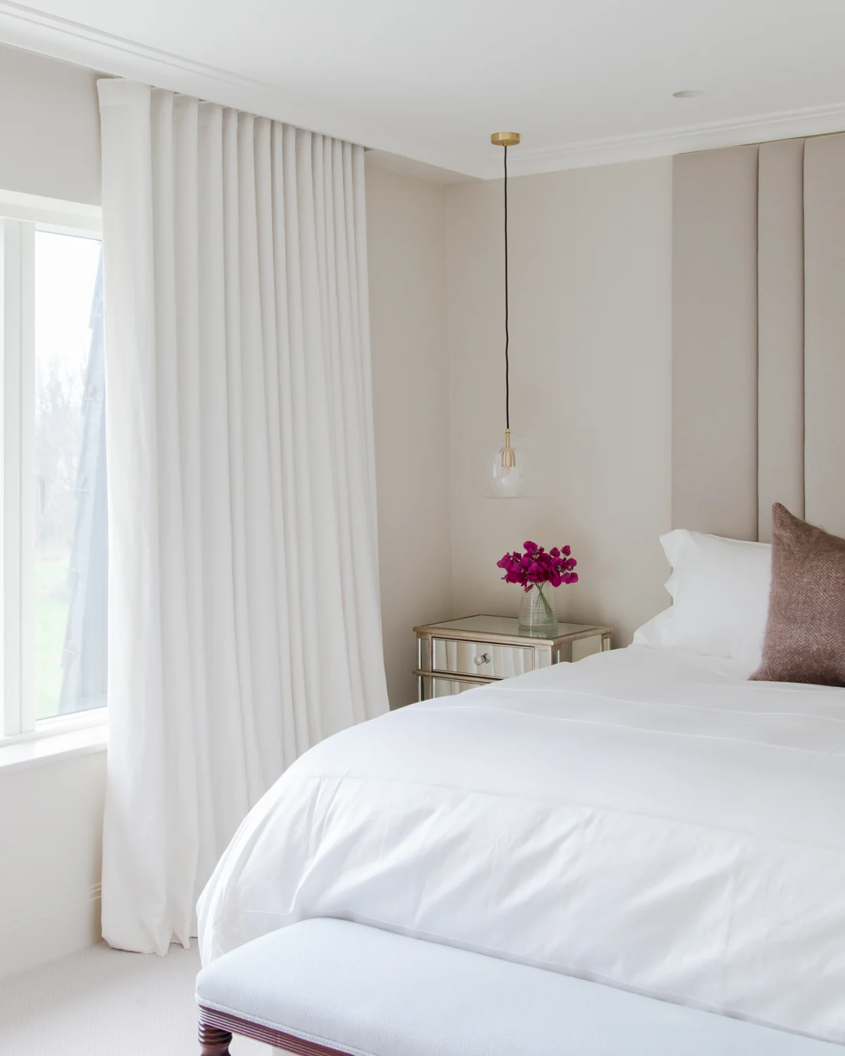
All-white bedroom decor
Create the ultimate calming space by having an all-white bedroom.

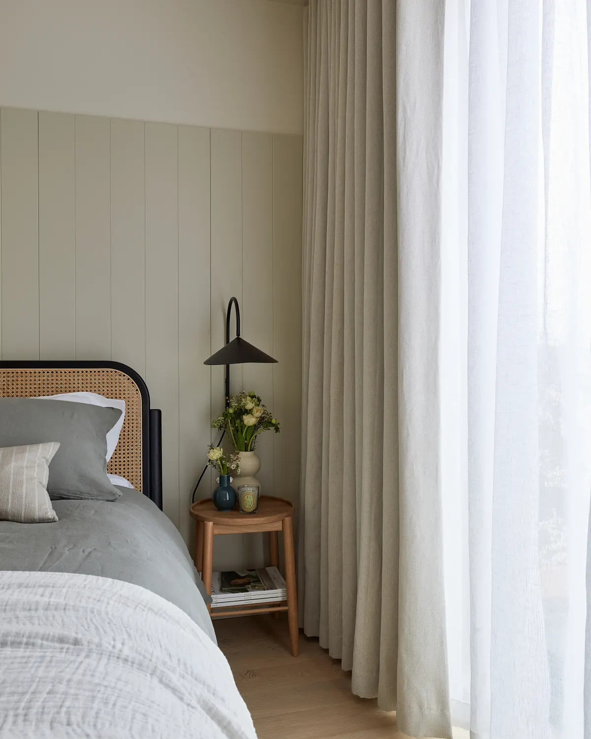
White sheer curtains
Perfect for bedrooms, overlaying white sheer curtains with a heavier fabric creates a luxury feel with added privacy.

White blinds for any room
A classic white transparent roller blind allows sunlight into a room and it’s simple design suits any decor.
A Brief History of White
White has been a favourite of artists since Paleolithic humans created the first cave paintings 18,000 years ago. Back then, calcite or chalk would have been used to add highlights and inject vibrancy into the works of art. Sixteen thousand years later, the Roman philosopher Pliny the Elder described the process of making white using the highly toxic lead white. Despite its deadly flaw, not only did lead white continue to be used by artists until the 19th century but, even more alarmingly, was used as a cosmetic to make skin look pale and smooth.
The much safer titanium white was first mass-produced in 1916 and by the end of the Second World War, was being used in 80% of all applications, from lines on tennis courts to the sparkle in toothpastes. White was a favourite of the Modernist movement and remains popular today with architects for its ability to emphasise the form of a building and not distract from the design.


The Psychology of White
White is the symbol of purity, peace and power. In Tudor times and beyond, fabrics such as cotton and wool would be heavily processed in order to appear white so it was only the wealthy who could afford to keep their lace, ruffs and cravats looking pristine. Fortunately, technology has moved on since then and at Stitched, we are at the forefront of producing fabrics that are kind to the planet and do not use any harmful chemicals in their production. Find out more about our eco-fabrics.


