Five colours set to make a splash this year
At this time, interior experts are busy predicting trends for this year and beyond. Fortunately, these trends move more slowly than in the world of fashion and have far greater longevity - - - which is just as well because we wouldn’t want to be re-decorating every season, would we? At Stitched, we’re firmly of the opinion that trends should be treated with caution. Our homes after all, should be a reflection of our personality and individuality. We therefore suggest you use a trends as inspiration and a catalyst to try ideas you may not have considered before whilst staying true to what you love.
Here’s our summary of the common themes emerging from the recent design festivals, exhibitions and presentations given by colour forecasters. These are the five colours set to be ‘big news’ next year and beyond.
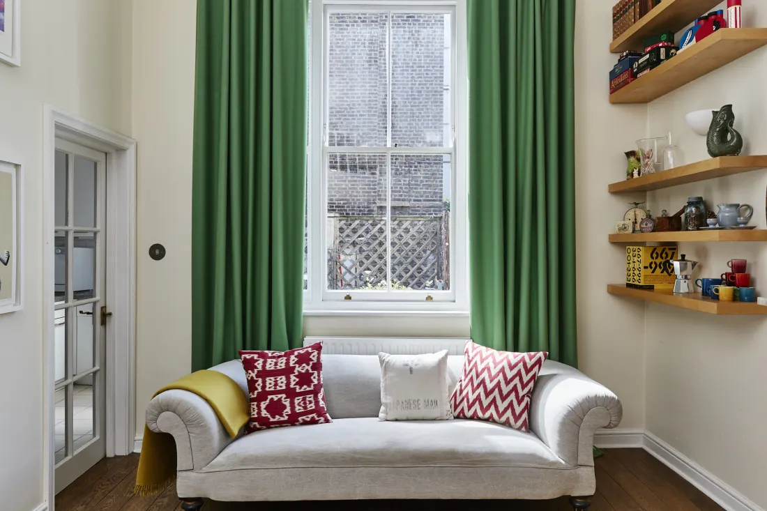
Green
As you may have noticed, the colour green is everywhere and at a time when an increasing number of us are embracing biophilia and plant-based diets as well as waking up to our responsibilities as consumers, the colour that is most connected with the natural world is bound to be popular. In many ways green is the ultimate neutral, sitting as it does in the middle of the visible light spectrum. It’s the colour associated with balance, harmony and rest, and its infinite variety means that a version of green can be found to suit any setting and complement any other colour. Dulux’s Colour of the Year for 2020 was ‘Tranquil Dawn’ a misty, pale grey-green while Homes & Gardens has chosen Sanderson’s Devon Green, a warm mid-tone green, as its Colour of the Year.
In short, green is not going anywhere and it’s predicted that as time goes on the popularity of unusual, ‘disrupted’ greens will increase - - - tones such as tobacco, arsenic and dare we say… avocado.
Industrial grey
Grey has been popular for some years and many have suggested its time in the spotlight might be over but those in the know predict that warm greys, particularly those with violet undertones will continue to be much in demand. Farrow & Ball’s ‘Charleston Grey’ and ‘Elephant’s Breath’ are examples of this type of grey - - - warm, friendly and easy to use. There’s no doubt that grey has a timeless quality but perhaps more than any other colour, it’s affected by the available light in a space. Green-based greys are best avoided in north facing rooms as they have a tendency to look drab. Opt for warmer greys instead.
Earth tones
Continuing the theme of connecting with the natural world, earth tones are set to be in high demand and likely to replace cooler greys. Rich, dark and warm, these colours support the idea of creating a welcoming, ‘heart-centred’ home. Tones such as chocolate, caramel, stone and russet reference the outdoors very directly and ground a space, providing a sense of stability and reassurance. These are the colours that invite you to settle in and make yourself comfortable.


Purple
Purple is going to be big. Is this, we wonder, because of the recent events involving the Royal family? This jewel tone - - - beloved by royalty - has a glamorous, exclusive quality and lends a sense of luxury to any space. Red-based purples look great with chocolate and other earth tones whilst navy blue and cool-based pinks are perfect with blue-based purples. Whatever version of purple you choose, it’s the perfect colour to bring drama and oodles of elegance to your home. It will look great with your house plants too!

Strange tones
What do we mean by ‘strange’ you’re wondering. Well, given that in recent years many of us have moved away from light neutrals such as magnolia to enthusiastically embrace dark tones, it was only a matter of time before the colours that fall in the middle of the extremes had their day. These are the mid tones, those colours that have sufficient underlying pigment in them to be interesting without being considered dark. It’s not just any old mid tone that’s going to be particularly popular but those we might not have considered using before. Mid tone pinks and oranges for example. Colours that can be introduced to disrupt a harmonious scheme and give it some edge. Which brings us neatly back to advocado. THE colour to choose if you’re planning to upgrade your bathroom perhaps…
Order some free samples
If you're inspired by the colours that are set to be big this year, why not order some free samples and get started on your new curtains and blinds!
ORDER SAMPLES


