Making your home colourful: how to work with a bold palette
Adding colour to your home is a wonderful way to create homely, comforting spaces that make you feel good. Colour is a very personal thing, some people are drawn to loud, vibrant colours, others prefer more neutral pastels. Introducing a bold palette can be daunting, but so too can adding more subtle colours. We have an inbuilt fear of colour and pattern in our homes. It’s not surprising when we have always been told that bright colours should be avoided in bedrooms, don’t paint the ceiling anything other than white, dark colours shouldn’t be used in small rooms, don’t use pink and red or green and blue together… Well, we think, your home, your decision! The colours you choose can be really significant, you could spend hours researching the benefits of using blue in the kitchen, or you could just decide that you want purple cabinets and done, decision made. However you make your decisions, whether it be off the cuff or after hours of research… we have some helpful tips to help you work with bold palettes and subtle shades.
Go bold or go home!
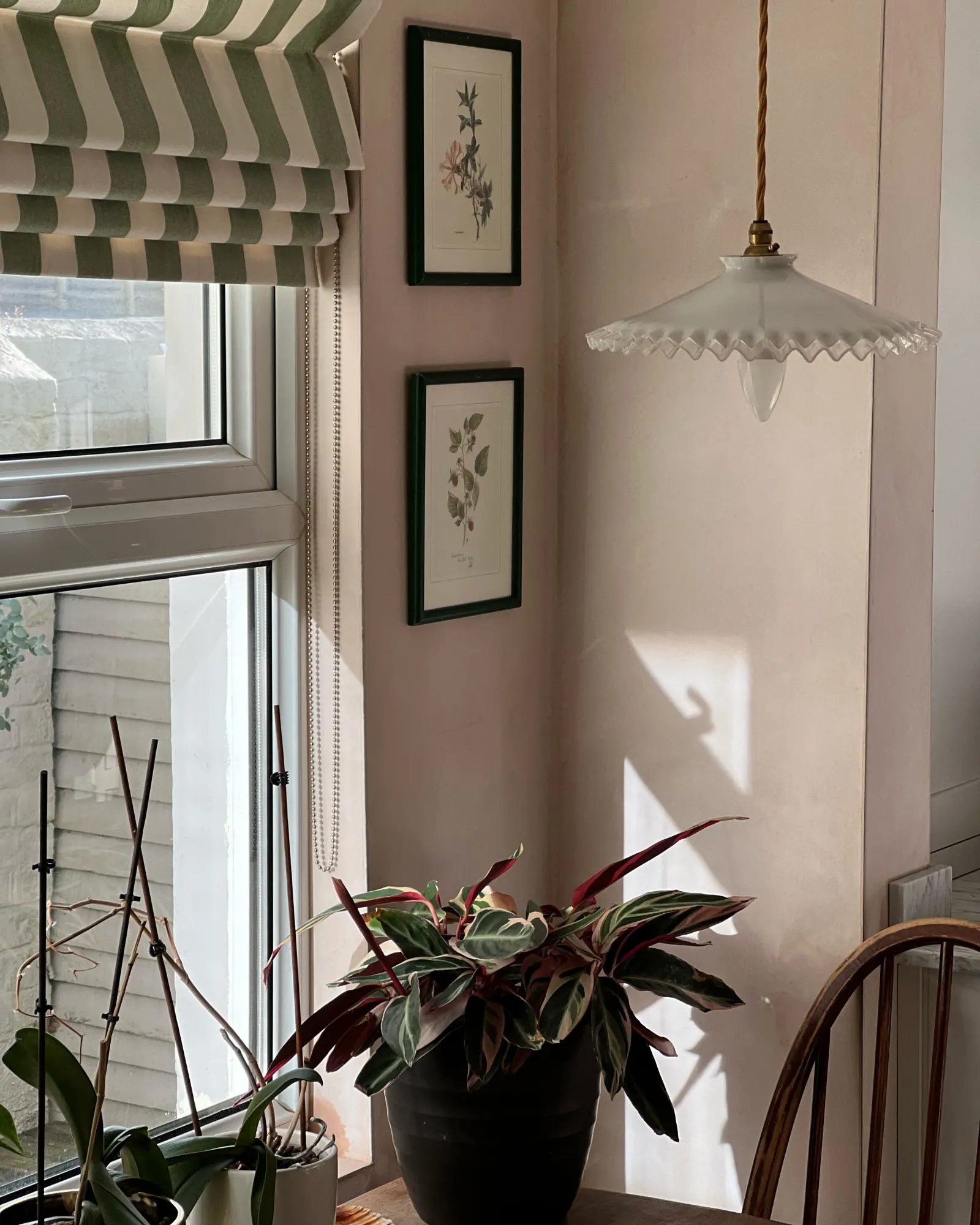
When it comes to adding bold colours, you have to own it. But that doesn’t mean you have to paint your entire room in holly red! This simply means that if you’ve decided to add a splash of colour, really go for it and go for the colour that you love the most. This can mean a hot pink runner on the staircase, leopard print bed clothes or green striped roman blinds in the kitchen.

Use more than one bold colour
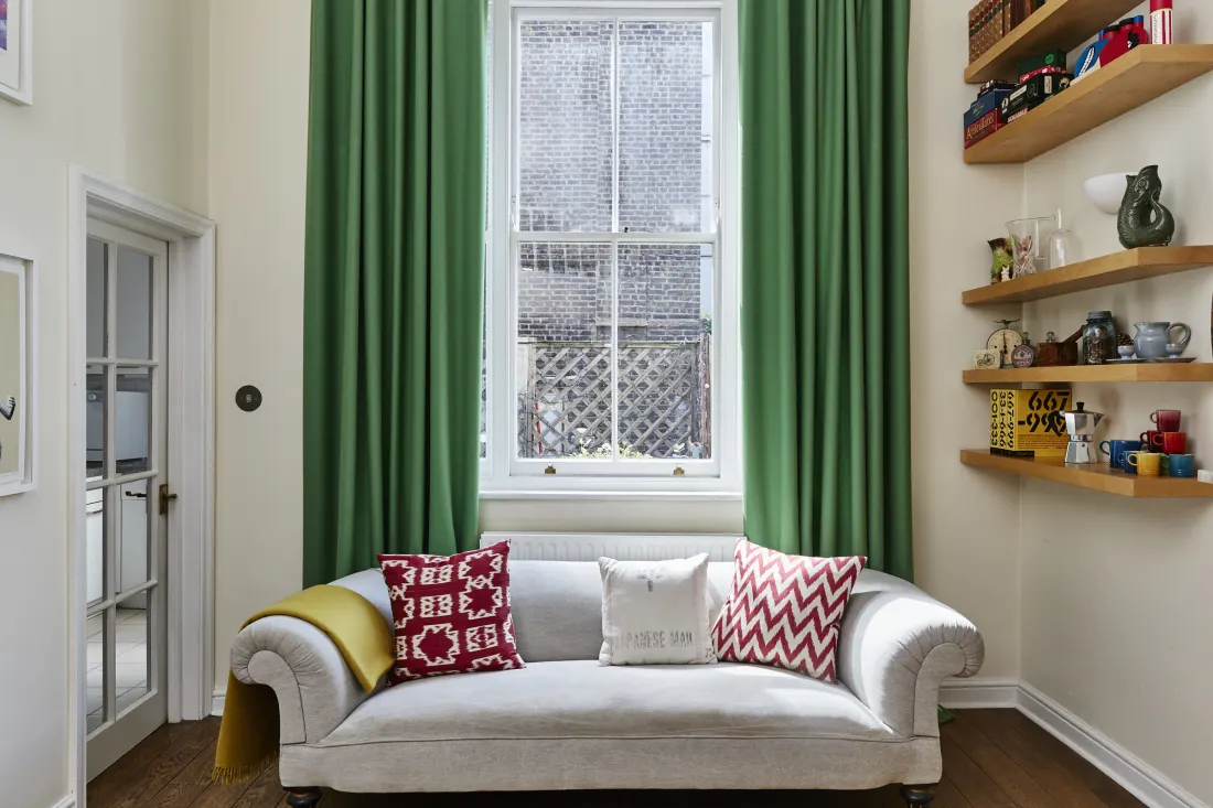
Colour blocking is a really fun way to use colour in your home. There are lots of ways to do this. You could use different coloured paints and create a design on your wall. Another really great look is to add a bold wallpaper on one wall, or even one part of the wall and then paint the rest of the wall or room in the boldest colour used in the wallpaper. Easier still, paint or wallpaper your walls and use your custom made curtains or blinds to create a colour block.
Mix bold and subtle colours
Choosing a more subtle shade of the colour you are using or even a different colour can really make your bold colour pop. Often when using a strong colour, it can look too stark next to white, thereby making us feel uncomfortable or uneasy. To create a more aesthetically pleasing palette use a subtle colour like soft pink, grey green or even a very soft blue either instead of, or in addition to, white.
Use your artwork for inspiration
Sometimes the best way to add more colour to your home is to use what you have! Often, the art we are attracted to contains the colours and tones that speak to us. Pick your favourite colour from your favourite picture or piece of art, whether that be a lampshade or the decorative bowl you brought back from your last holiday. Pick a bolder hue of that colour for a piece of furniture for your new made to measure curtains to create a really cohesive use of colour.
Copy Mother Nature!
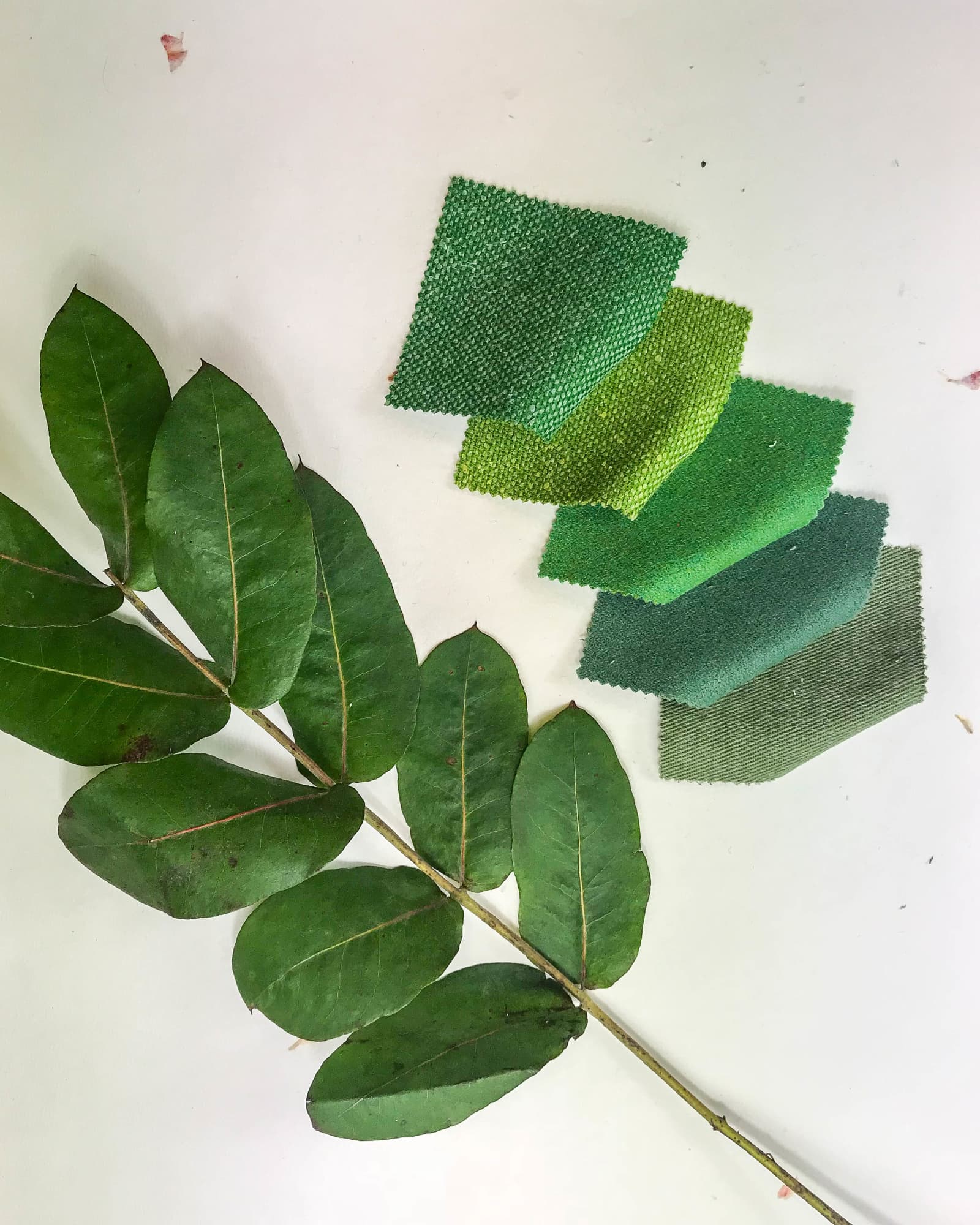
If you look at all the beautiful colours in nature you’ll see how they all work together to create stunning landscapes. Copying mother nature’s palette is easy, you just have to look around! Different shades of reds, yellows, pinks, blues, greens and browns all together, clashing, highlighting and enhancing each other. You can do this too in your home. Add some wooden shelving on top of your bold colours or use plants and flowers and natural elements to add more colour or tone down to a colourful room.
View our range of colours here and download our app to see what your windows would look like with a pop of curtain colour!

Need more inspiration?
Get more colour inspiration for your curtains and blinds on our blog.
THE STITCHED BLOG