Introducing Pantone’s Colours of the Year 2023
Pantone’s Colour System was designed to standardise colour in the printing industry by classifying colours by a number, hue, tone and tint. Some 20 years after launching its first ‘Colour of the Year’ - - - colourists from every industry, from branding, to marketing and design, eagerly await the announcement in December and this year was no different. Enter Pantone Colour of the Year 2023 ‘Viva Magenta 18-1750’.
What is Viva Magenta?
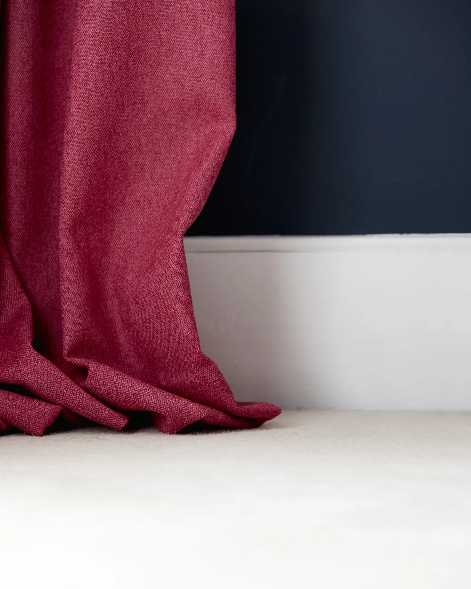
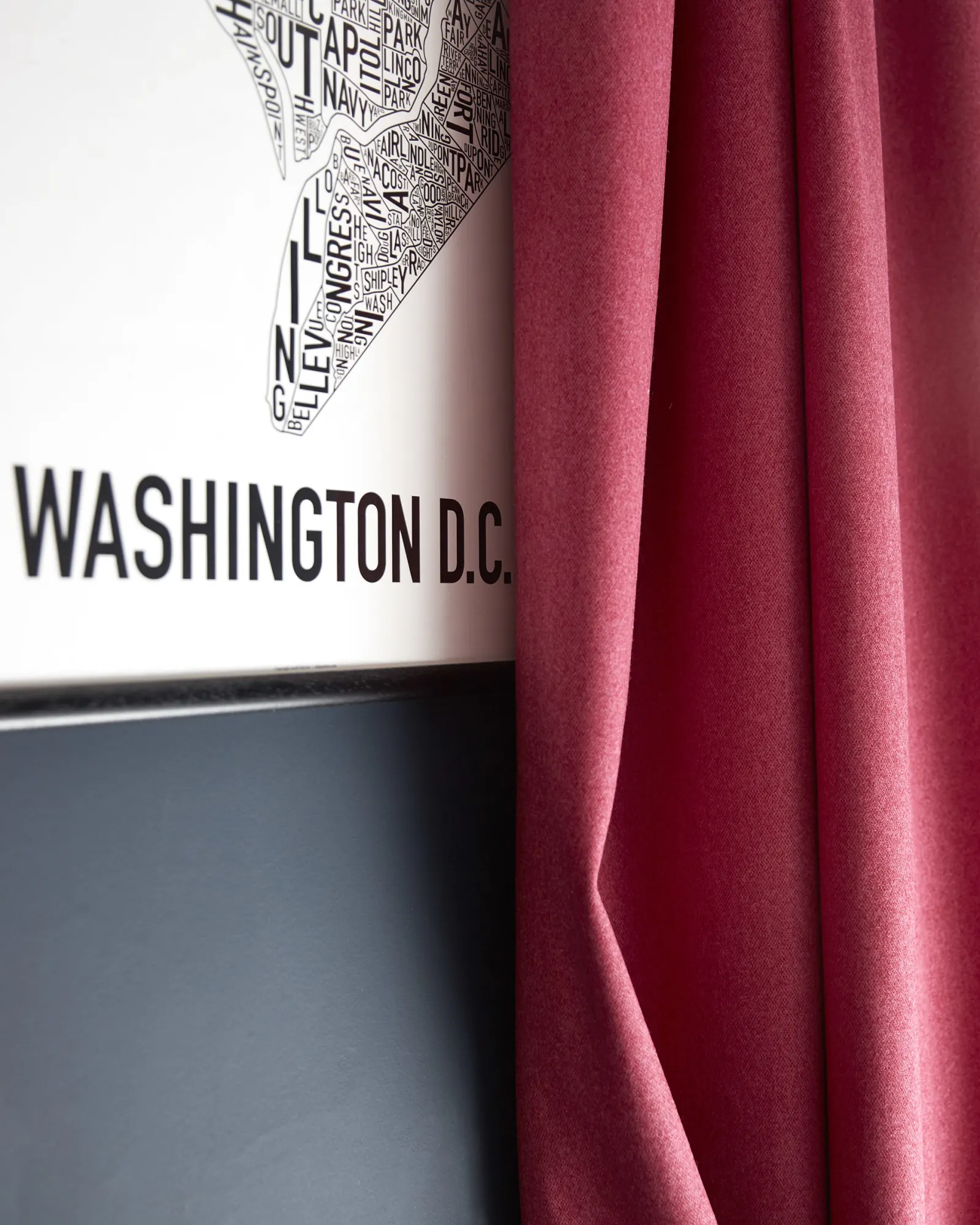
As a dynamic red tone, Viva Magenta 18-750 takes inspiration from nature, expresses a new era of strength and celebrates an optimistic and joyful outlook. After the last couple of years, this year’s colour showcases a ‘new narrative’ and gives us a shade to express ourselves with colour in a ‘brave and fearless’ way. From the red family, it is a colour that is ‘inclusive of all’, to be used in all areas of our lives, encouraging experimentation. It’s an uplifting and versatile colour, that complements a variety of hues and tones, and can make any space feel alive yet warm.
Styling with Viva Magenta 18-750
The red shade is ideal for creating an uplifting mood - - - when a colour like this is used in a space, it draws your attention immediately. An impactful and empowering hue that can be used on walls in living rooms or floor-to-ceiling bookshelves, we see it being used in many different spaces, from traditional to modern, even cosy, interior schemes.
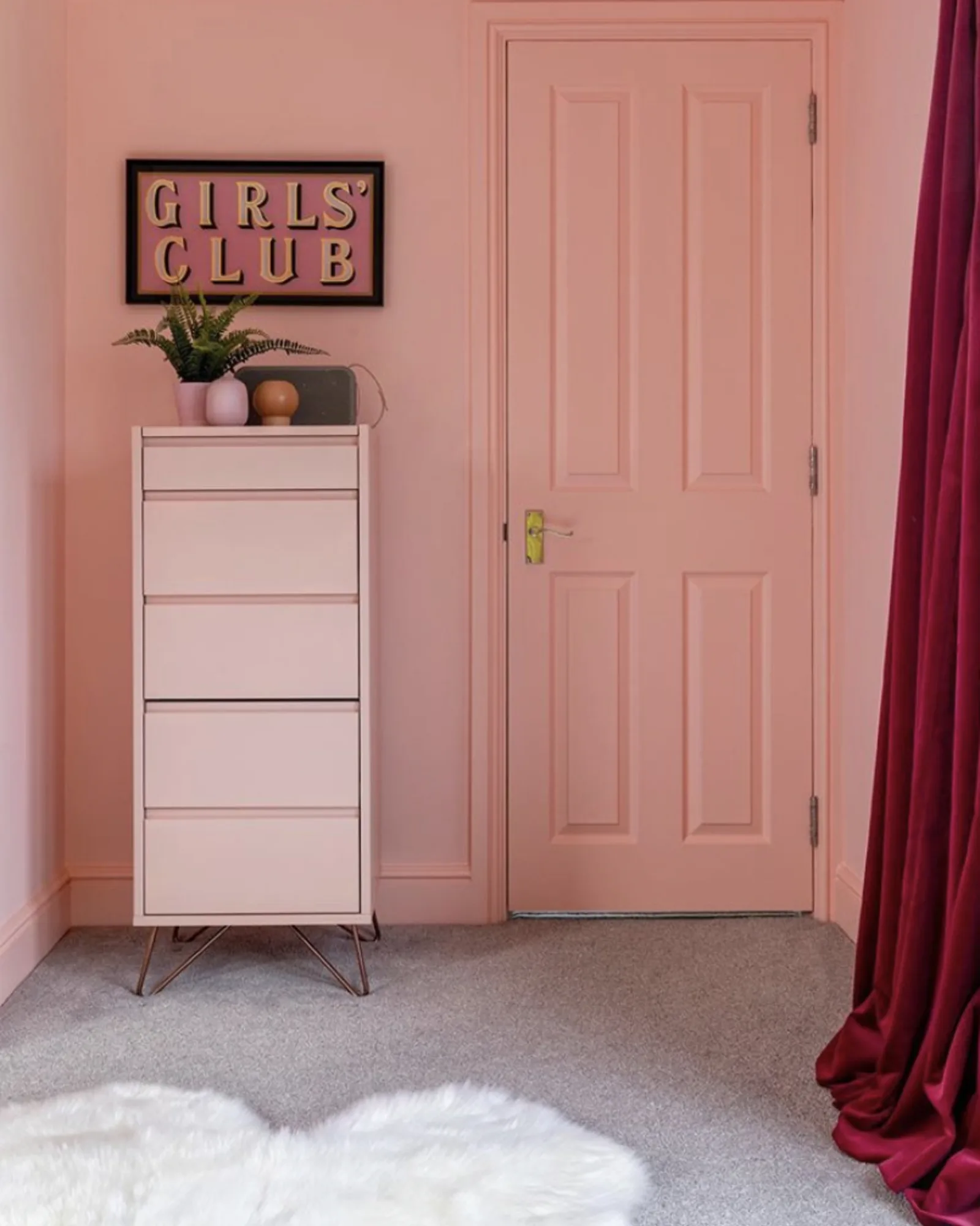
Pantone has also released ‘Magentaverse’ a selection of muted neutrals that perfectly pair with Viva Magenta, from khaki greens and greys to grey lilacs to pastel pinks. Minimalists among us will use Viva Magenta as a pop of colour and pair it with pale greens, blues and neutrals. But, the maximalists could try a monochromatic trend, combining with pastel pinks to really make a statement with a space.

Introducing Viva Magenta into a space
An easy way to introduce colour into a space is through the accessories you choose. Viva Magenta is a great colour for accessories such as pillows, throws, and lamps, to larger room pieces such as curtains and blinds. You don’t need to paint an entire wall or room with a vibrant red colour, instead, create interest in a room by updating the accessories. Choosing a statement colour for your curtains and blinds is a great way to frame your windows and works great when a similar colour is also dotted around the room using other decor pieces.
For an understated but extremely sophisticated look, layer Viva Magenta hues with muted neutrals. Try lighter earthy tones or more pastel greys, pinks and blues. These tones work beautifully together because they have the same underlying warm pigments. The trick with using a tonal palette is to introduce lots of texture for added interest. If you want to open up your windows and increase the sense of space, you could opt for our delicate Relaxed Linen or Satin Linen ranges. Alternatively, if you’d like to increase the sense of luxury and cosiness, try our Velvet, Pink Opal or Wool, Calypso to make a statement.

Start creating with Viva Magenta
If you're inspired and ready to update your home with Pantone's Colour of the Year, whether that be an accent colour to go with Viva Magenta accessories or Viva Magenta curtains and blinds, start by ordering some free samples.
ORDER SAMPLES