
Colour Stories: The Neutrals
In the past, neutrals have often had a bad rap. Synonymous with magnolia paint and estate agents’ advice to paint homes cream, neutral decorating schemes have sometimes resulted in rather bland, characterless spaces. But times are changing and after a number of years of embracing our dark sides with deep cocooning colours in our homes, we’re starting to see a return to lighter, brighter hues.
How to use neutrals in your home
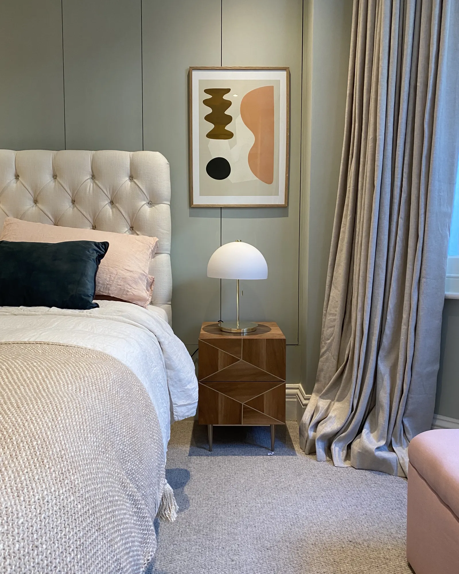
Blinds or curtains in a neutral fabric will make a room feel airy and understated and done well, a neutral scheme has the power to be sophisticated, elegant, uplifting and timeless. The amount and type of light in a space has the most significant bearing on how neutrals look, so it’s important to establish which way your room faces and then select your colours accordingly.
In the Northern hemisphere, North-facing rooms have a clean, consistent light but don’t receive any direct sunlight. Colours tend to look cooler and harsher, and these rooms can suffer from a lack of light. Often, the advice is not to fight this and instead create intimate, cosy spaces with strong, dramatic colours. However, if you’re keen on a lighter look, opt for warm neutral curtains with a touch of yellow or red in them. Avoid those with a green or grey base. Choosing a warmer neutral is ideal for bedrooms to create a cosy environment.
East-facing rooms get the morning light which is fresh and a little blue. Neutrals with a green or blue base will work in harmony with the available light, so go for cool neutral curtains in a fabric like our Milan Nude Satin Linen. West-facing rooms are more muted in the morning and get the evening light which is warm. Yellow and red based neutrals will enhance this warmth but greyer neutrals will also work well, looking cooler earlier in the day and warmer later on. The light in East/West-facing rooms changes dramatically throughout the day. It’s often best to decide when you spend most of your time in these rooms and choose neutrals to suit. So if the room is used more in the morning, such as a kitchen, go for cooler neutrals; if it’s a place to relax in the evening, choose neutrals with a warmer base.
South-facing rooms are a decorator’s dream and any neutrals will look good in them. To really enhance the feeling of warmth and light in these rooms that are bathed in sunlight for most of the day, opt again for yellow or red based neutrals such as our Nudes range. To create a crisper look, choose neutrals with a cooler base.

It's all in the layering
The key to creating a successful neutral scheme is to choose a colour that will work in your space and then introduce lighter or darker tones of the same colour to create depth and interest. The same principle can be applied to soft furnishings. So choose a blind fabric that works tonally with your neutrals but is a little lighter or darker. You might then team this with curtains that are in a darker tone still. This subtle graduation of colour is sophisticated and never jars.
If you want to add a little more drama to a neutral space through the injection of ‘colour’, choose hues that work with the palette you’ve chosen. So, if your neutrals have a yellow or red base, opt for warm colours; if they have a green, blue or grey base, choose cooler colours.

Texture and colour
When we’re planning to decorate a room we naturally focus on how it will look but sight is just one of our five senses and a well designed space should engage them all. Nowhere is textural variation more important than in a room decorated with a neutral palette. Not only does a room with different textures look good but it improves our sense of well-being, inviting us to touch and full engage with our surroundings. Stitched fabrics were born to be touched and our warm neutral made to measure blinds and warm neutral made to measure curtains are a great way of adding textural interest to a space. Team our sheer fabric with our Linton range for a breezy, summery look. Enjoy the feel of our slubby Silks and our super soft Velvets.
All colours take on a different personality in artificial light so before deciding on a neutral palette, buy some tester paint pots, order some fabric samples and see how the colour looks at all times of the day and evening. Move the samples around the room - the darkest corner and the brightest spot - to view the colour in different conditions.

Our top neutral fabric picks
Earthy, practical and considered - - - here's some of our favourite neutral fabrics.
ORDER FREE SAMPLES


