Book a free virtual design consultation
How to create the perfect colour scheme
Have you decided your home needs a refresh but don’t know where to start? Colour can be transformative but equally daunting and although we are all drawn instinctively to certain tones, deciding how to put them together can be tricky. Here are our five tips to help you create the perfect colour scheme for your home.
1. Find inspiration everywhere
Start with an open mind. Collect magazine cuttings of images you like, take in the colours of your environment and the natural world. Try to analyse why some colours resonate with you. Is it their richness, crispness, purity or warmth that appeal?
It’s rare that we start with a completely blank canvas and there may well be a piece of fabric, artwork or treasured possession you want to include in your freshly decorated space. In fact, fabric or artwork are often a great starting point, enabling you to pick out colours to create a palette. This catalyst doesn’t have to take centre stage in the finished room - - - it may just be a cushion cover or small object d’art but by reflecting its colours in the wider scheme, you’ll end up with a coherent and considered look.

2. Don’t forget form and function
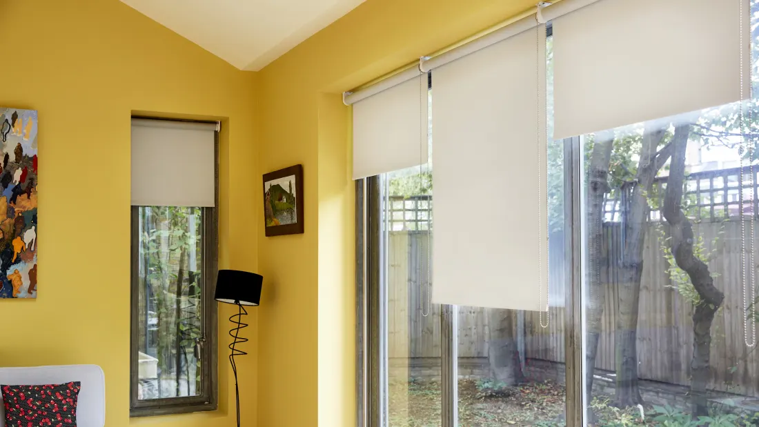
Which way does your room face and how much natural light does it receive? What lies immediately beyond the window - - - trees and vegetation, an urban street or a brick wall? These factors will determine how colours look in a space.
In the northern hemisphere, warmer tones tend to suit north and west facing rooms whilst cooler tones complement the cool, crisp morning light in east facing rooms. If you’re lucky enough to be decorating a south facing room, which is likely to be bathed in natural light all day, you can go for any colours you like!
Think too about how and when you use the space. What is the primary function of the room? In a home office used throughout the day, the right tones of blue will aid concentration and clarity. In a family snug used in the evening, a warm, dark, enveloping colour will cocoon and relax.


3. Get to grips with the colour wheel
The colour wheel was created by Sir Isaac Newton who, in joining together the two ends of the colour spectrum, produced the first circular diagram of logically presented colours. At Stitched, we recognise how useful the colour wheel can be in creating a scheme and include one in every sample pack. All colours on the wheel originate from the three primaries - - - red, yellow and blue. By mixing together two of these, you get the secondary colours of orange, green and violet. These can then be mixed together to create tertiary colours and so on and so on.
White, grey and black do not appear on the colour wheel because they are achromatic, ie technically not colours, but they can be added to any colour on the wheel in varying degrees to create myriad tints, tones and shades. Complementary colours, such as blue and orange, sit directly opposite on the colour wheel and when used together will make each appear more vibrant and dynamic. If complementary colours are used in equal proportion in a space, the effect can be uncomfortable so the answer is to use them in different measures, separate with a neutral or reduce the intensity of colour by using versions of the hues where white, grey or black have been added.
A harmonious scheme will comprise colours that sit next to each other on the colour wheel. These colours can be light or dark, intense or almost neutral but work best together when the intensity of each is the same. As with a complementary scheme, it’s best to allow one colour to dominate and use neutrals to provide balance.


4. A helpful ‘rule’
Whilst the process of creating a colour palette should be instinctive, it does sometimes help to follow rules employed by the professionals. The designer Abigail Ahern swears by the 60-30-10 principle when decorating a room. She will choose a dominant colour to apply to 60% of the space. This invariably means painting walls and woodwork in the same colour - - - something that will instantly make a space look more contemporary. But it may also mean applying the same colour to ceilings and floors for a truly unifying look. She then adds in a few complementary colours (the 30%) in the form of upholstery, curtains or blinds and large pieces of furniture. The final touches (the 10%) are the ‘jewellery’ of the room, the metallics that add glamour and sparkle.
5. Create flow
Are you planning to decorate a single room, a hallway, a series of spaces or the whole house? Are you looking for a home that has a unified colour palette or would you like each room to have a distinct look? If it’s the former, then a smart way of achieving the desired effect is by deciding on a main colour and then using lighter or darker versions of it in different rooms. If you choose a darker tone for the hall and lighter tone for the rooms leading off, these rooms will feel lighter and more spacious than if you’d used the same colour in the hallway.
If, alternatively, you’re keen to give each room its own identity by using different hues, it’s still a good idea to opt for colours with the same underlying pigments and same intensity of colour. That way you will create a pleasing sense of flow throughout your home.


And finally,
Never make a decision on colour without seeing a sample of it in situ. The same colour will look completely different depending on how much light, both natural and artificial, falls on it. So, always invest in tester pots of paint and samples of fabric. Paint large pieces of lining paper in your chosen colours and see how they look in different areas of the room, at different times of day and night. Place curtain and blind fabric samples at the relevant window. Do they work with the wall colour? How does the light fall on them? What do they look like under artificial light?
At Stitched, we know how important samples are in enabling you to make an informed decision which is why we offer a choice of 8 free of charge. Why not start planning a new colour scheme for your home today!