Introducing Pantone’s Colours of the Year 2021
Created in 1963, the Pantone Colour System is the most important colour matching system in the world. Originally designed to solve the problem of standardising colour in the printing industry, every hue, tone and tint is classified by a number. In 2000, the Pantone Colour Institute created its first Colour of the Year, Cerulean Blue, as a trendsetting concept for branding, marketing and the world of design. And in December each year, colourists from all fields eagerly await the announcement of the new Colour of the Year.
This year, things are a bit different as Pantone has introduced not one but two Colours of the Year for 2021 - - - Ultimate Grey; a pale, soft dove grey and Illuminating; a buttercup yellow. According to Pantone’s trend forecasters, two colours were chosen because “it became apparent that there was never going to be one colour that could express everything that needed to be expressed - - - that it was, instead, critical to have two independent colours that could come together.” After the year we’ve all had, they have a point!
So, how to use yellow and grey in the home? The combination is not without its detractors. Vogue describes it as ‘really weird’ and others have said that it conjures up images of hi vis vests and road markings! That said, colour psychologists tell us grey is the perfect neutral that works well as an accent or backdrop, and yellow is the ultimate colour for creating sunny, happy spaces. So, this ‘marriage of strength and optimism’ is definitely worth considering. Here are our three top tips to get the pairing of yellow and grey right.

1. Choose the right kind of yellow and grey
By which we mean, two things. Firstly, ensure your yellow and grey have the same undertones; in other words, that both are warm versions of the hue (with yellow or green pigments) or both are cool (with blue or lilac pigments). That way, the colours will sit well together and create a cohesive look.
Secondly, ensure the versions you choose suit the space and the amount of natural light it receives. You’ll want warm yellows and greys in a north-facing room to counteract the lack of direct light. Warm tones also work well in west-facing rooms to complement the warm afternoon light they receive. In contrast, cooler tones work well in east-facing rooms and any type of yellow and grey will look good in a sun-drenched south-facing room.


2. Let one colour be the star of the show
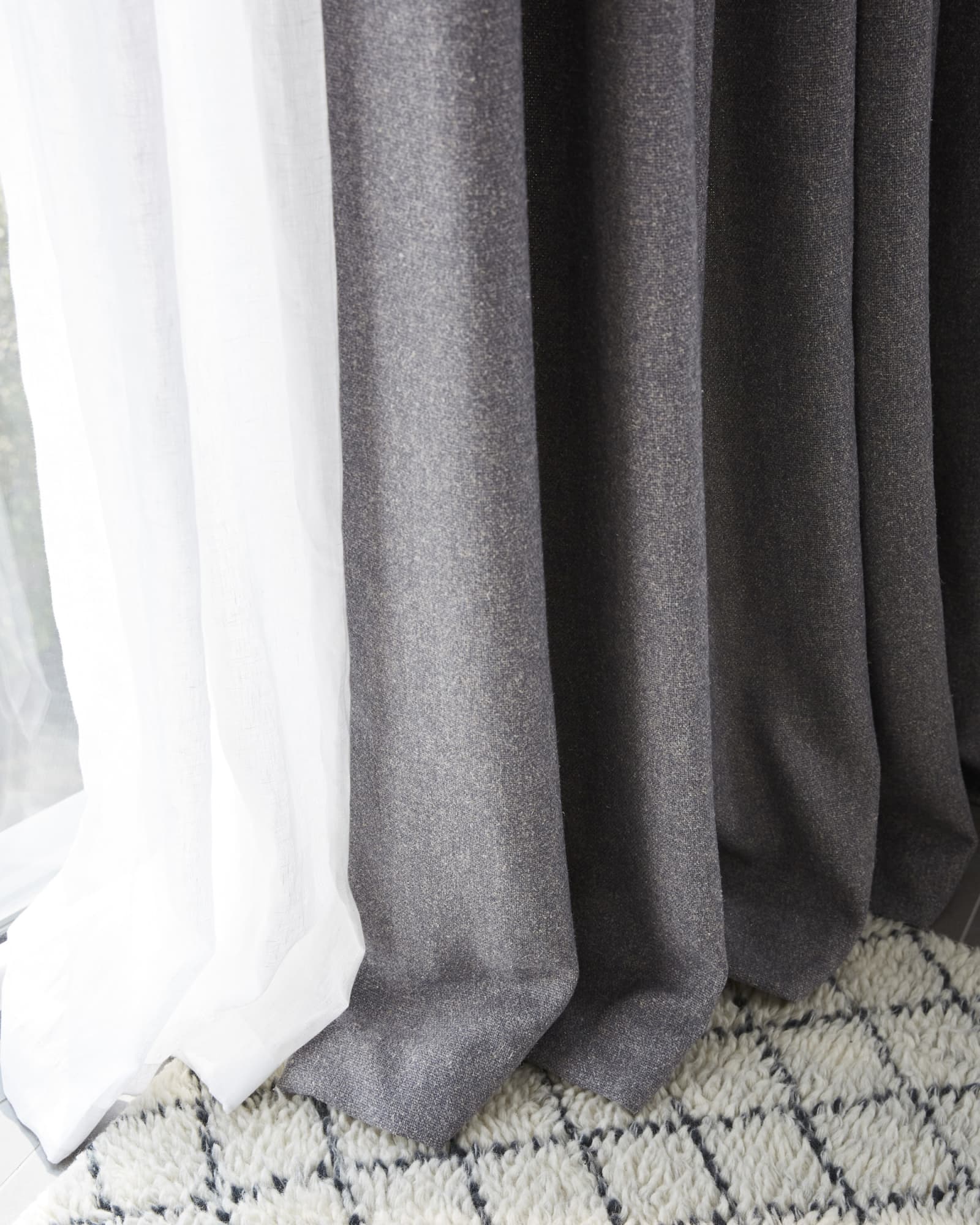
As with any colour scheme involving two or more very different hues, it’s essential not to use them in equal proportions. Instead, allow one to dominate to avoid a scheme that is too vibrant and jarring. So, how about a yellow front door with a grey frame, sunshine yellow towels to add a sense of fun to a graphite grey bathroom or a gorgeous pair of yellow curtains to inject drama to warm grey walls?
The addition of neutrals and lots of texture to a yellow and grey scheme will provide a bridge between the colours and create harmony as well as greater depth and interest.
3. Play to the strengths of yellow and grey
It’s important to recognise that a yellow and grey scheme will suit some spaces more than others. Both colours are best avoided in bedrooms - - - grey because it’s said to make you wake up feeling tired and yellow because you’re likely to wake up irritable and annoyed as well! Similarly, this pairing is said not to be such a good idea for nurseries and babies’ bedrooms.
Instead, consider using yellow and grey in a hallway or, with an emphasis on yellow, any space where you want to create light, warmth and a friendly welcome.
Be ahead of the curve and start creating your own Pantone 2021 space today by discovering our beautiful range of yellow and grey fabrics.
