Book our home measuring service in London
How to Use Dulux’s Colour of the Year 2021 in Your Home
Autumn is the time of year when the design industry unveils new collections and looks firmly forward. First up, paint supplier Dulux, which has recently launched its Colour of the Year 2021 - - - Brave Ground. In the company’s own words, it’s ‘a warm, earthy tone that creates a feeling of stability, growth and potential; and provides a firm foundation for change and creativity in the home’. Given the turbulence and uncertainty of recent times, it’s easy to see why they’ve decided on such a colour.
Colour trend forecasting is a tricky business with much time and money spent on predicting what will be popular in the year ahead and beyond. Companies such London design agency Colour Hive draw on myriad, global influences that drive consumer behaviour and somehow manage to distill this data into colour palettes we can use in our homes. We’ve said before that interiors trends need to be created with caution. Your home should be a reflection of your personality and filled with what you love, not subject to the fickle whims of fashion. That said, we should all be open to inspiration so we asked our team to pull together three schemes featuring Brave Ground and suggest curtain or blind fabrics that work beautifully with each. They were up for the challenge and the perfect excuse to play around with colour. Read on to discover their recommendations.

01. Tone on tone
For an understated but extremely sophisticated look, layer Brave Ground with darker and lighter earthy tones. It’s a bit like being in a coffee shop and ordering everything from a babychino to an espresso, and all options in between! These tones work beautifully together because they have the same underlying warm pigments. The trick with using a tonal palette is to introduce lots of texture for added interest.
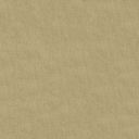
If you want to ‘open up’ your windows and increase the sense of space, you could opt for one of our delicate Nudes such as Limestone, Wheat or Champagne. Alternatively, if you’d like to increase the sense of luxury and cosiness, try our Mushroom Silk or Smoky Quartz Velvet.


02. La Dolce Vita
This scheme transports you to the sun-baked streets of Siena. Pair Brave Ground with putty, dusky oranges and baked clay tones. Perfect for traditional and contemporary spaces, this palette gives a nod to the popularity of bright colours but rather than the bold incarnation of the hue, uses its more grounded, grown-up cousin.
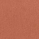
These colours are perfect for a bedroom or other place where relaxation is the order of the day. Orangey/pink tones are incredibly flattering to the skin so you’ll look as well as feel your best in spaces that use this palette. Try our Vitality Revive and Burnt Orange Classic Cotton fabrics to create this look.


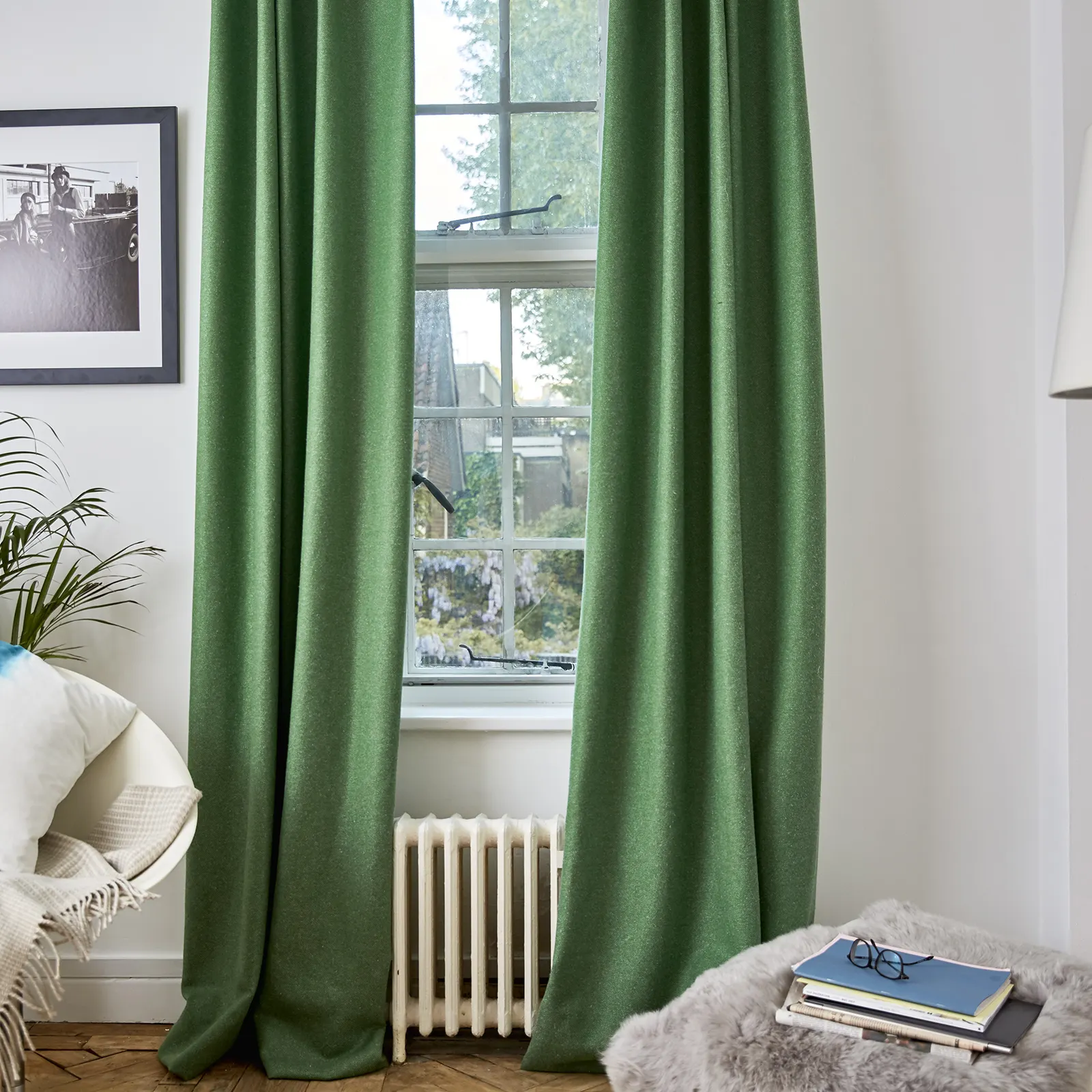
03. Back to nature
This time last year, we were extolling the virtues of green and there’s no doubt it has increased in popularity recently as many people embrace the concept of biophilia and recognise the benefits of a greater connection with nature. In many ways, Brave Ground is a natural progression from this year’s colour Tranquil Dawn - a calm, misty green - and it makes sense that the two should work well together.
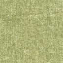
So, take inspiration from a walk in the woods and nature’s own palette to combine Brave Ground with greens, both dark and light. Accessorize with natural materials and lots of indoor plants. Fabrics such as Moss Linton, Matcha Hemp and Emerald Velvet work beautifully here.

Don’t forget...
You should always test paint and fabric colours in situ before making a decision. Use a tester pot of Brave Ground to paint a large sheet of lining paper and then tape it to different areas in the space. How does it look at different times of day and under artificial light? After ordering 8 free samples of fabric from us, place them around your windows so you can see how the fabric will look in different lighting, so you can really envisage your new scheme.